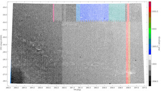
 In TopCat one can easy apply a weight to the pixel values in a scatter plot. In this example, I have a database of 3.5 million 2MASS sources seen toward the Pipe Nebula and I have made sure I retained all the database columns provided by the project, including quality flags, observational details and information regarding cross-matches to optical source catalogs. In the figure above, I have made a simple equatorial plot of all 3.5 million sources; in TopCat one can change the point size and transparency, which I have done to make a surface density plot of the region. The general trend in increasing surface density from the NW corner to the SE corner is in the general direction of decreasing Galactic lattitude. A couple of other features are worth noting: a series of white patches of lower surface density stretching from about (RA,DEC) = 258.0,-27.5 to 265.0,-25.5 correspond to where a dark molecular cloud blots out background stars; other smaller white spots are where sources near very bright stars were excluded from the 2MASS catalog; small dark spots are high spatial concentrations of sources, which in this case are Globular Clusters (I can quickly spot 5 of them). I color coded each pixel by the date of its observation by the 2MASS telescopes (see vertical color bar). What does visualizing this tell us? There are a range of observation dates over a 2-3 year period, the data appear tiled in strips that are narrow in RA and very long in DEC, and there is some kind seam in the data at about DEC=-23.6.
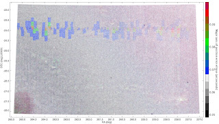
Here I use the positional uncertainty quoted in the database to color the pixels. While the quoted positional accuracy (catalog wide) is of order 0.1" at size scales smaller than this there are some interesting (to me!) stepwise variations in the quoted accuracy.
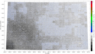
Finally, there is an interesting column that lists the number of optical sources within 5 arcsec of the 2MASS source. Huh. I can only guess we are seeing somekind of footprint of variations in the sensitivity of the optical data, which appear block wise corresponding to the individual photographic plates. I can understand why the optical-infrared associations change near the edges of the dark cloud. But otherwise the grid like pattern is intriguing. To me, of course
